

Fieldglass (acquired by SAP) creates products for procuring contingent labor workforce, which is the technical term for HR software that helps staffing agencies and HR departments source and manage their temporary workers (contractors and project-based workers).
Additionally, here's the most recent app that was shipped by Fieldglass -- the Time Entry app (link goes to App Store) :

Fieldglass was struggling with growth and adoption in the Latin America market due to the strong blue-collar sector often involving on-site work in remote locations, a scenario that Fieldglass's technology was not originally built to accommodate.
What success looks like: Grow our Latin American market by securing 3 new clients with remotely distributed blue-collar workers.
Leverage existing technology and features built out in our web application and extend to an mobile app in order to save dev resources.
There was ultimately a hypothesis attached to these business goals, which was to extend our existing Assignment Management feature into a mobile app product that we would use as a pre-sales tool to secure customers in the Latin American segment.

Given our leadership team's hypothesis of creating a mobile app that extended existing functionality, it was my self-assigned goal to validate this hypothesis and any other assumptions.
For example, here are a few questions I asked my product manager:
Does it have to be a mobile app? Why?
Does it make sense to use our Assignment Management feature? Why?
What are our competitors doing? If nothing, is that an opportunity for us or warning flag to pause and rethink our approach?
Why do some companies choose our competitor's workforce management products for similar scenarios?
What is our primary metric for success?
What have we tried in the past, if anything (that most closely resembles this project)? Why did it succeed or fail?
Do we have any existing research (data, feedback, etc) that could be relevant?
I learned that this entire product doubled as a pre-sales tool. Because of this, it became evident to me that we were designing a product for a completely new kind of persona.
Because I was operating under the constraint of not having direct access to the potential users of this pre-sales product, I had to get creative with how I recruited research participants.
I interviewed any and all members of our pre-sales team with experience interacting with any client users in the Latin American market (or any other companies with similar needs.
Our sales team had recent success in Japan, so I contacted our Japanese pre-sales team as well.
I was also able to collect some artifacts that reflected the Japanese market's current process for documenting completed assignments and expensing labor hours:

I rigorously screened for co-workers who were interested in participating in my user interviews by confirming if they had any work experience with manual labor and working remotely (i.e. off-site) in varying environmental conditions.
Three main reasons:
1. This was a quick way for me to gain user empathy. My co-workers went through similar scenarios as the end users I was designing for, so why not include my co-workers?
2. No need to incentivize/compensate internal participants, and therefore not needing to worry about pariticpant providing answers under the motivation of money or gift cards (read: we save time and money).
3. Champion the practice of user research and data-driven design throughout Fieldglass by interactively involving my co-workers one by one.
Already, our conversations with the Pre-sales Team yielded many deep insights -- below is a visual note-taking example from our session with our Japan Pre-sales Team, who happened to have clients with a scenario similar to our Latin American market:

I led a synthesis session in order to make sense of all of our findings and package everything into a succinct story to show my leadership team and other stakeholders.
One framework that I used was Jobs-To-Be-Done (JTBD) :
When...
remotely-distributed, blue-collar workers
are trying to...
complete assignments and expense materials and tools
in a situation where...
they are working in rural, middle-of-nowhere locations with variable lighting and weather conditions...
they struggle to...
have a reliable internet connection to document their completed assignments with and ultimately get paid for their work.
A lot of tedious communication was happening between workers "in the field" and their co-workers back in the office. Note the notes used as instruction text for the user to ensure accurate completion of these spreadsheets:

In order to clearly tell the story of the end user's workflows and articulate their pain-points, I mapped it out using a first-person perspective.
The 80% scenario:

How might we (HMW)...
guide the field workers to know exactly what assignments they need to complete, how to complete them, and how to show that it is complete.
guarantee accuracy of the data going back and forth between supervisors and their field workers in order to reasssure that expenses will be reimbursed and workers will be paid accurately and on time.
balance a "blue-sky" design proposal with budget and deadlines by building upon existing Fieldglass functionality in order to save on time and dev effort.
Let's start designing by "working backwards from perfect."
While keeping our "How might we" questions and "jobs to be done" framework in mind, I led a collaborative whiteboarding session. Mapping out the potential workflows for using JTBD helped unearth possible mental models through which the user would expect to complete assignments.
Our whiteboarding sketches also helped me define what were likely the majority user scenarios (A,B, or C below). Doing this helped us scope and prioritize which workflows I needed to design.

As a user, how would I expect to complete an assignment?
In a the most typical scenario, what's the mental model of a field worker user?

Dark UI Saves battery. Workers can be away from a wall charger for long periods of time.

Introduce more visual hierarchy; brighter colors easier to see while standing outside?
Previously, the Cards in the UI did not afford clicking (finding from Usability). Make the cards a standard pattern.

We were wrong!
After going through the above iterations and doing a round of usability sessions, here's what we learned (in an updated mental model diagram).

We had a few A-ha moments too.
Let's empower the user to continue documenting their work in "offline mode" and submit their work once their device regains connection.
I took my phone outside, stood under the sun, and set my phone screen at full brightness. Sure enough, some elements lacked enough contrast to be discoverable.
Oops! I should have consulted with our UX writers much sooner. Let's re-evaluate our wording choices together and use more inclusive and "human" language.
Provide more literal step by step guidance through the UI, as workers are usually multitasking in the field.

As a worker, I need to have sufficient context to make sure I'm documenting work on the correct assignment (and have "just enough" instructions).

As a worker, I need to attach photos to document that I've completed my assignments.

Tip: Watch using full-screen!
We had a software development team with no existing specialization in mobile app development. On top of that, developing a mobile app required us to switch to a new UI framework that we had never used before, and was a mish mash of Fieldglass components and SAP components. This all resulted in a very conservative approach to our development process and how much bandwidth there was to design for optimal usability.
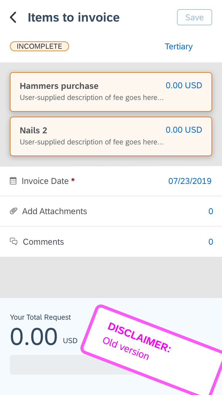
In addition to the art of compromise, I sought stakeholder buy-in by involving my project team members in my design and user research process as frequently as possible. This helped them build empathy for the user. This was especially true when I was designing the 4th iteration of the screen for expensing items. I was able to convince stakeholders that the UI needs to be more straightforward and simply guide the user with more visual hierarchy.
Because this was a new mobile app, there were many strong opinions and thus lots of "design by committee" that happened during each project meeting. While this was happening, I was guiding my intern on how she could best contribute to this project.
I came to embrace the fact that "design" will always continue to happen outside of my design team. So I put myself in a position where I can be more of a conductor of a design orchestra by sharing my Invision prototypes early and often in order to invite feedback and comments. This put me in a more proactive position to secure stakeholder alignment.